Happy Holidays everyone. I hope you all are enjoying your break!
While stumbling around on the net this break I stumbled upon another blogger's stumble.
While we are supposed to be starting to think about our next type project this article, 201 Ways to Arouse Your Creativity, might come in handy. Check it out:
http://writetodone.com/2010/06/28/201-ways-to-arouse-your-creativity/
Sunday, December 26, 2010
Wednesday, December 15, 2010
Illuminated Letter
Project Four:
Project four for typography I. was to create three illuminated letters based on the styles of three famous artists. An illuminated letter is an embellishment, or additional decoration that enhances the pages of a written or, manuscript page.

Ansel Adams

Edward Penfield

Lester Beall
The three artists I chose to use for my final project are Lester Beall, Edward Penfield, and Ansel Adams. I originally chose Guercino, however, after much failed attempts to create something that worked, I switched to Adams. This project was one of the more difficult ones of the semester for me. I'm not sure if maybe it was because of everything else I had going on that was due before this one, or if it was just me loosing steam at the end of the semester.
The piece that I am most happy with is Penfield's. I think it best represents the artist and the key image that i chose. The final piece looks quite a bit different than many of my sketches. However the 'P' that I had drew was one of my original sketches.
A major accomplishment for me during this project was gaining the skill of using the stylus. I was having difficulties using real water colors and paints and making it look similar to the key image. The stylus helped me create an image that looked similar to paint, without actually using the medium. While I used it for the Penfield piece, I think I made the most success with the stylus when creating the clouds for the Adams piece. I had a lot of fun experimenting with darks and lights to create a sky.
-Dani
Saturday, November 27, 2010


Tuesday, November 2, 2010
back to the basics.
After Effects. It has been much more difficult than anticipated. I love the idea of being able to make things move and control what the viewer sees, when they see it and how they see it. However, I don't know how good at it I am. I think I am just technologically inept most of the time. I know that everyone no days says, "print is dead," "Print is a dying art." I say no. And while I love learning new software and expanding my design abilities, I'm ready to get back to it.
I very much believe in the importance of research and inspiration for a project. All of this I have done for my font project... but a few weeks ago I felt like it was time for some tangible inspiration.

... only to begin a serious sign obsession.. more to come?
I very much believe in the importance of research and inspiration for a project. All of this I have done for my font project... but a few weeks ago I felt like it was time for some tangible inspiration.

... only to begin a serious sign obsession.. more to come?
Sunday, October 10, 2010
mad world.
Since when are movie prices $10?? I guess I haven't been too see a movie in the theater for about 5 months but really? That seems a bit excessive. I get where people think that raising the price on everything will help them, but its not the solution. I think people need a more intensive history lesson because it seems that us Americans never learn from the past. During the Great Depression, movies were $.27 a ticket. Obviously, money was worth much more back then, but it was still a relatively inexpensive "get away" for people that were going though a hard time. Throughout most of the Depression, Americans went regularly, devotedly, almost compulsively, to the movies…the movies offered a chance to escape the cold, the heat, and loneliness and they brought people together. Movies became an escape from reality.
SO again my point, what exactly is the point of making movies so expensive, it just makes people less likely to go?
What was the spark of this rant you ask?
I went to see Wall Street this weekend with my mom (to whom they should have only charged $5 because she slept through half of it). Even though I know absolutely nothing about business, nor am I much interested in it, I thought it was really good. In relation to my previous point, it paralleled a lot of today's economic issues to the ones during, and prior to, the Great Depression. Another thing I haven't done in awhile that I did this weekend was go to church. The priest made a good point (pretty much the only one I caught), he said that from the time we are all little, one of our first words is always "mine." We can be such selfish creatures. Maybe if people weren't so obsessed with "things" and wanting "more".. we wouldn't be in this mess that we are today. People are so concerned with their own "misfortunes" and "situations" most of the time we don't take two seconds to stop and look around us.
I feel so blessed to be able to go to the amazing school that I do and to have to opportunity to study something that I love. Sometimes it gets so stressful I think that we forget to appreciate how awesome it is that we have this amazing gift, and how many people would give anything to have to opportunities and experience we are having.
What is The Definition of Insanity?
"It's doing the same thing over and over and expecting different results."
think about it -D
Monday, October 4, 2010
Mind your Ps and Qs
other potential titles for this blog:
"We'll all be poor artists in the old folks home."
"Why wood type?"
"Props for keeping the Letterpress alive."
I am currently in letterpress 310 with Linda and would be very interested in visiting Two Rivers, Wisconsin.
One of the points mentioned in the film that was particularly intriguing to me was the thought about people needing to think more about their work, to slow down.
From personal experience, letterpress certainly does this. Our current project is a concert poster. The class in on Friday mornings from 8:30-12:30. We have had 5 classes so far and two more left before our posters are due. It takes a long time to come up with your idea, set your type, carve the linoleum and print... using the exact picas.
While it may sound like I am complaining about this class, its the opposite actually. Hand made arts and crafts is a topic that really interests me. I like hand made books, old bindings and the 3D feeling that letterpress gives a 2D piece of art.
"Luscious, textile, sexy"
Sunday, October 3, 2010
wanna know some more?

"Hoefler and Frere-Jones create fonts that stand out with the clarity, elegance, and durability of a well-cut diamond.... An H&FJ typeface is always exquisitely legible without sacrificing high style." –Time Magazine
Interstate is a neo-grotesque sans-serif typeface designed by Tobias Frere-Jones in the period 1993–1999, and licensed by Font Bureau. The typeface is closely related to the FHWA Series fonts, a signage alphabet drawn for the United States Federal Highway Administration in 1949. Frere-Jones' Interstate face, while optimal for signage, has refinements making it suitable for text setting in print and on-screen, and gained popularity as such in the 90s. Due to its wide spacing it is best suited for display usage in print, but Frere-Jones later designed another signage typeface, Whitney, published by Hoefler & Frere-Jones, which bears a resemblance to its ancestor while being less flamboyant and more economical for general print usage, in body copy or headlines. Familiarity lies at the heart of legibility. Interstate is based on the signage alphabets of our Federal Highway Administration, letterforms absorbed at a glance everywhere we drive. Interstate provides a real edge in swift communication.
The terminals of ascending and descending strokes are cut at an angle to the stroke (see lowercase t, and l), and on curved strokes (see lowercase e and s), terminals are drawn at a 90° angle to the stroke, positioning them at an angle to the baseline. Counters are open, even in the bold and bold condensed weights, further contributing to legibility. The font is used by a number of large organizations in their logotype and branding materials. Notable examples include Sainsbury's Supermarkets, recent signage for Southwest Airlines, Invesco Perpetual, UK rail company c2c, Ealing, Hammersmith and West London College, Lamborghini and Cognizant Technology Solutions. In May 2008 Ernst & Young adopted the use of Interstate in marketing materials and reports as part of a new global visual identity.In 2004, The Weather Channel started using the fonts on-air and on IntelliStar systems. It was added to TWC's WeatherSTAR XL in a graphical update in 2005. It was mainly retired in 2008, for Helvetica Neue and Akzidenz-Grotesk. In November 2006 the US Army launched its Army Strong ad campaign, utilizing Interstate as its primary typeface for all ad material.
Tobias Frere-Jones (born Tobias Edgar Mallory Jones, 1970[1]) is a prolific type designer who works in New York City with fellow type designer Jonathan Hoefler at Hoefler & Frere-Jones, a type foundry in lower Manhattan. Frere-Jones teaches typeface design at the Yale School of Art MFA program, with type designer Matthew Carter.
He is a son of Robin Carpenter Jones and his wife, the former Elizabeth Frere, and a brother of music critic Sasha Frere-Jones. He is a grandson of Alexander Stuart Frere-Reeves, the former chairman of the board of William Heinemann Ltd, the British publishing house, and a great-grandson of the writer Edgar Wallace, who wrote the screenplay for the film King Kong.[1]
After receiving a BFA in 1992 from Rhode Island School of Design, Frere-Jones joined Font Bureau, Inc. in Boston. Over seven years as a Senior Designer, he created a number of the typefaces that are Font Bureau's best known, among them Interstate and Poynter Oldstyle & Gothic. He joined the Yale School of Art faculty in 1996 as a Critic. In 1999, he left Font Bureau to return to New York, where he began work with Jonathan Hoefler. Since working together, the two have collaborated on projects for The Wall Street Journal, Martha Stewart Living, Nike, Pentagram, GQ, Esquire magazine, The New Times, Business 2.0, and The New York Times Magazine. He has designed over seven hundred typefaces for retail publication, custom clients, and experimental purposes. His clients have included The Boston Globe, The New York Times, the Cooper-Hewitt, National Design Museum, the Whitney Museum, The American Institute of Graphic Arts Journal, and Neville Brody. He has lectured at Rhode Island School of Design, Yale School of Art, Pratt Institute, Royal College of Art, and Universidad de las Americas. His work has been featured in How, ID, Page, Print, Eye Magazine, and Graphis Inc., and is included in the permanent collection of the Victoria & Albert Museum, London. In 2006, Frere-Jones received the prestigious Gerrit Noordzij Prize, an award given by The Royal Academy of Art (The Hague) to honor innovations in type design. He married Christine Annabelle Bateup in 2006.
Feeling that experience from one style can inform new efforts in another, he aims for the widest possible range in his work. He feels equally at home with a traditional text face as with a grungy display face. He seeks inspiration from deliberately non-typographic sources; the music of Schoenberg, the theories of Tesla and Pythagoras, and a row of shopping carts have all provided the initial spark.
When asked if the world really needs any more typefaces, he replied, “The day we stop needing new type will be the same day that we stop needing new stories and new songs.”
The World
A combination of factors including the mass mobilization of capital markets through neoliberalism, the beginning of the widespread proliferation of new media such as the Internet, and the dissolution of the Soviet Union led to a realignment and reconsolidation of economic and political power across the world, and within countries. The 1990s is often considered the end of Modernity and the dawn of the current Postmodern age.[1] Living standards and democratic governance generally improved in many areas of the world, notably East Asia, much of Eastern Europe, Latin America, and South Africa. New ethnic conflicts emerged in Africa, the Caucasus and the Balkans, and signs of any resolution of tensions in the Middle East remained elusive.[2]
The public generally uses the expression "the Interstate" to refer not just to specific highways but to the concept of a connected national system of freeways.
Interstate Program 4.0 Congress designates Future Interstates; more leniency on tolling
The Font Bureau, Inc., a Boston-based typographic firm that counts Apple, Microsoft, Newsweek, the Chicago Tribune and Wall Street Journal among its clients, filed suit against NBC this week, alleging the network did not secure the rights to the typefaces it used to promote “The Jay Leno Show,” “Late Night with Jimmy Fallon” and “Saturday Night Live.”
According to the 118-page complaint, filed Tuesday in the U.S. District Court, the Font Bureau says that NBC infringed on its trademarked and copyrighted fonts on NBC.com and CNBC.com. It is seeking “no less than $2 million” in damages.
The Font Bureau says NBC and CNBC used its Bureau Grotesque, Interstate and Antenna fonts without permission.
http://www.fhwa.dot.gov/highwayhistory/howmany.cfm
http://en.wikipedia.org/wiki/Tobias_Frere-Jones
http://www.fontbureau.com/people/TobiasFrereJones/
http://typography.com/about/press.php
http://www.thewrap.com/media/column-post/nbc-sued-over-use-fonts-8462

Wednesday, September 29, 2010
9/29 Type Homework.
_ Old Style
.based on handwriting
.slight diagonal stress
.shorter x-height
.Bembo, Caslon, Garamond, Jenson, Palatino
_ Transitional
.contrast between thick and thin strokes is more pronounced
.very slight diagonal stress
.bracketed serifs
.Baskerville, Caslon, Perpetua
_ Modern
.mathematical construction /measurement
.extreme contrast between thick and thin strokes
.flat unbracketed serifs
.Bodoni, Bauer Bodoni, Walbaum
_ Slab Serif
.mono weight
.square ended serifs
.no stress
.Serifa, Rockwell, Memphis Clarendon, New Century Schoolbook
_ Sans Serif
.Geometric (Futura, Foilio, Gotham, Avant Garde), Humanist (Gill Sans, Meta, Frutiger), or Grotesque (Akzidenz Grotesk, Franklin Gothic, Univers, Helvetica)
.influenced by the Bauhaus movement
.feature circular or geometric letters
_ Script
.Script typefaces often mimic handwriting techniques
.Lowercase letters are deliberately irregular to further effect the look of handwritten text
.nostalgic association with the post WW2 era.
_ Blackletter
.Legacy German text typefaces now used for display
. sometimes called Old English
.The first printed types
_ Grunge
.The most recent typographic wave
.belief that the medium is the message
.the merger of the industrial functionalist movement called Bauhaus with Dadaism
_ Monospaced
.All the font's characters have the same width
_ Undeclared
Interstate is....
.San Serif
.Designed by Tobias Frere-Jones
.1993–1999
.Grotesque
.Extra Light, Extra light italics, light, light italics, regular, regular italics, bold, bold italics, black, black italics, ultra black, ultra black italics, hairline, hairline italics, thin, thin italics, light condensed, light condensed italics, extra light condensed, regular condensed, regular condensed italics, bold condensed, bold condensed italics, black condensed, black condensed italics, ultra black condensed, hairline condensed, thin condensed, extra light compressed, light compressed, regular compressed, bold compressed, black compressed, ultra black compressed, hairline compressed, thin compresses, pi one, pi two, pi three, pi four
Tuesday, September 21, 2010
yes. it is what it looks like.

My randomly selected font for the next, mystery project is Interstate. And no, it is the font used on signs on the interstate. Althought it was designed based on the font, used by the Federal Highway Administration (Highway Gothic has been used used on signs across the country for more than a half-century) and was one of the most popular typefaces in the 90s.and was one of the most popular typefaces in the 90s.
It is a san-serif typeface designed by Tobias Frere-Jones in the period 1993-1999.
While it is optimal for signage, it can also be suitable for text and on screen settings.
Many notable organizations have adopted Interface in their marketing and signage.
A few examples:


Also, In 2004 the Weather Channel began the use of Interface. However, they use Helvetiva for their logo (Yes, I was extremely jealous when "J" was sitting right next to me and drew Helvetica, my favorite font)... way to stick with a theme Weather Channel.

Easy ways to SPOT Interstate
- The tail of the lowercase "g" is a good indicator. It looks like its trying to form a hook but doesn't quite get there.
- Many of the ascenders and descenders have sharply angled tops or bottoms.


Everything else you would want to know about Interstate
- Interstate "provides a real edge in swift communication."
- It gives the impression of being raw, but it's a lot more elegant than its source.
- Frere-Jones and Cyrus Highsmith have expanded it into what Font Bureau calls "a plethora of enticing styles"
- Very similar to FF DIN, which is also based on street signs.

Monday, September 20, 2010
rooms.rooms.rooms.
Admitedly, At first I wasn't too into this whole "blogging" thing. However, just as I have embraced my new design filled life, I have embraced the world of glorified Xanga.
This weekend, while I was stumbling around looking for some interesting blogs to follow for my journalism class, I came across this post. It shows mostly writer's rooms but there are a few illustrators and composers' work spaces too.
http://www.guardian.co.uk/books/series/writersrooms
Check it out for yourself
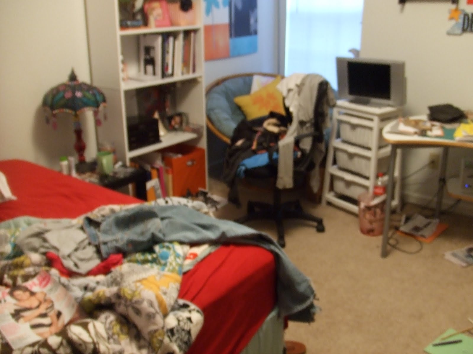
This inspired me to share my room/workspace with you...


Thank you for not judging my mess.
Happy designing.
-D
This weekend, while I was stumbling around looking for some interesting blogs to follow for my journalism class, I came across this post. It shows mostly writer's rooms but there are a few illustrators and composers' work spaces too.
http://www.guardian.co.uk/books/series/writersrooms
Check it out for yourself
This inspired me to share my room/workspace with you...


Thank you for not judging my mess.
Happy designing.
-D
Saturday, September 18, 2010
People Like Us.
Some stuff I liked by people like us
http://www.wix.com/lp_designs/lp_designs
http://mediamilitia.com/get-inspired-014/


http://www.wix.com/lp_designs/lp_designs
http://mediamilitia.com/get-inspired-014/


Inpiration Point.


 << Nike rocks.
We are all sooo close to the end of the first two projects. Its nice to know that everyone is feeling the pressure too. Hang in there everyone!
Wednesday, September 1, 2010
Today I Type to You
Adrian Frutiger: Today I type to you.
Without your creation of some of the most commonly known, and widely used, font in the world, where would we be today? Well, the Charles De Gaulle International Airport in France wouldn't have this sign:

Today, Frutiger font is commonly used on signage, such as this, and logos.
Frutiger's work with type began at a young age with an apprenticeship as a compositor. He then continued his studies at the Zurich School of the Arts and Crafts. After, he worked as a typeface designer at Deberny & Peignot in Paris. He also founded his own studio in collaboration with Bruno Pfaffli and Andre Gurtler.

In 1957 Frutiger established his position as an international typeface designer with his Univers-san serif font, produced for metal and film.
In the 60s' and 70s' you could get Univers for the IBM Selectric typewriters. Until 2007, Apple used Univers for the keycaps on many of its keyboards.

Currently the Univers type family consists of 44 faces with 16 uniquly numbered weights, widths, and position combinations.
Monday, August 30, 2010
INSPIRATION
 ...for tonight's festivities at the every wonderful -shutz
also.
THE ART OF PROCRASTINATION
is...
Always easy to put things off until tomorrow
Making a cup of tea
Scanning your sketches.. even though your not done with your sketches
Blogging, when I don't particularly like blogging
Researching procrastination
Sunday, August 29, 2010
Type. i compiti due.
weight. How think or thin characters outlines are displayed in text. Typefaces may come in fonts of many weight.
width. Varying of the width of the characters. Narrower fonts are usually labeled compressed, condensed or narrow. Wide fonts may be called wide, extended or expanded.
Style. Variations in the thickness and stroke, such as light, bold, italic, that lend flexibility and emphasis in the appearance of characters constituting a typeface.
Type is measured in picas
Point. a unit of measurement that is the standard for measuring type and is used for measuring depth of printing. One point is equal to .013836 of an inch and 72 points are approximately 1 inch.
Pica. the depth of this type size as a unit of linear measurement for type, pages containing type, etc.; one sixth of an inch.
72 points in an inch
6 picas in a inch
12 points in a pica
If a letter set is 36 pts. it is 1/2 inches tall
x-height. The x-height is the height of the main body of the lowercase letter (or the height of a lowercase x ), excluding its ascenders and descenders. The bigger the x-height is in relation to the cap height, the bigger the letters will look.
cap height. The cap height is the distance from the top of the capital letter to its bottom. Some vertical elements (ascenders) may extend slightly above the cap height.
leading
Monday, August 23, 2010
VISC202
Grid: a way to communicate a coherent message using pictures, fields of text, headlines, and or tabular data. They can be rigorous and mechanical, or organic and loose. A grid consists of a distinct set of alignment-bases relationships that serves as a guide for distributing elements across a format.
Benefits and uses of the grid: Clarity, Efficiency, Economy, and Continuity. A grid introduces systematic order to a layout and helps distinguish specific types of information and eases a user's navigation through them.
Modular Grid: A grid system using columns and rows.
Margins: the negative spaces between the format edge and the content, which surround and define the life area where type and images will be arranged.
Columns: vertical alignments of type that create horizontal divisions between the margins. There can be all numbers and sizes.
Grid Modules: individual units of space separates by regular intervals that, when repeated across the page format, create columns and rows.
Flowlines: alignments that break the space into horizontal bands. Flowlines help guide the eye across the format and can be used to impose additional stopping and starting points for text or images.
Gutter: the middle of two pages.
Hierarchy: based on the importance the designer assigns to each part of the text, allows the viewer to enter the typographic space and navigate it.
Typographic Color: changes in weight, texture or value, and rhythm.
Ways to achieve a clear hierarchy: manipulating the spaces around and between test, treating contrast carefully, and changing the typographic color of the element.
Hey world. Welcome to my blog. This will mark my first ever blogging experience, so bear with me.


Our first assignment for VISC204 involved the selection of an animal. Being the tallest, and one of the largest animals currently walking the earth, giraffes were my immediate selection (closely followed by penguins and hippos). Our project is in the beginning stages so here are a few pictures I found from my research that began to inspire me.
some food for though: Giraffes only sleep about 30 min every 24 hours and only need to drink about once every one month. How would you feel if you had to bend down 18 feet to the nearest water source?
Subscribe to:
Comments (Atom)