_ Old Style
.based on handwriting
.slight diagonal stress
.shorter x-height
.Bembo, Caslon, Garamond, Jenson, Palatino
_ Transitional
.contrast between thick and thin strokes is more pronounced
.very slight diagonal stress
.bracketed serifs
.Baskerville, Caslon, Perpetua
_ Modern
.mathematical construction /measurement
.extreme contrast between thick and thin strokes
.flat unbracketed serifs
.Bodoni, Bauer Bodoni, Walbaum
_ Slab Serif
.mono weight
.square ended serifs
.no stress
.Serifa, Rockwell, Memphis Clarendon, New Century Schoolbook
_ Sans Serif
.Geometric (Futura, Foilio, Gotham, Avant Garde), Humanist (Gill Sans, Meta, Frutiger), or Grotesque (Akzidenz Grotesk, Franklin Gothic, Univers, Helvetica)
.influenced by the Bauhaus movement
.feature circular or geometric letters
_ Script
.Script typefaces often mimic handwriting techniques
.Lowercase letters are deliberately irregular to further effect the look of handwritten text
.nostalgic association with the post WW2 era.
_ Blackletter
.Legacy German text typefaces now used for display
. sometimes called Old English
.The first printed types
_ Grunge
.The most recent typographic wave
.belief that the medium is the message
.the merger of the industrial functionalist movement called Bauhaus with Dadaism
_ Monospaced
.All the font's characters have the same width
_ Undeclared
Interstate is....
.San Serif
.Designed by Tobias Frere-Jones
.1993–1999
.Grotesque
.Extra Light, Extra light italics, light, light italics, regular, regular italics, bold, bold italics, black, black italics, ultra black, ultra black italics, hairline, hairline italics, thin, thin italics, light condensed, light condensed italics, extra light condensed, regular condensed, regular condensed italics, bold condensed, bold condensed italics, black condensed, black condensed italics, ultra black condensed, hairline condensed, thin condensed, extra light compressed, light compressed, regular compressed, bold compressed, black compressed, ultra black compressed, hairline compressed, thin compresses, pi one, pi two, pi three, pi four
Wednesday, September 29, 2010
Tuesday, September 21, 2010
yes. it is what it looks like.

My randomly selected font for the next, mystery project is Interstate. And no, it is the font used on signs on the interstate. Althought it was designed based on the font, used by the Federal Highway Administration (Highway Gothic has been used used on signs across the country for more than a half-century) and was one of the most popular typefaces in the 90s.and was one of the most popular typefaces in the 90s.
It is a san-serif typeface designed by Tobias Frere-Jones in the period 1993-1999.
While it is optimal for signage, it can also be suitable for text and on screen settings.
Many notable organizations have adopted Interface in their marketing and signage.
A few examples:


Also, In 2004 the Weather Channel began the use of Interface. However, they use Helvetiva for their logo (Yes, I was extremely jealous when "J" was sitting right next to me and drew Helvetica, my favorite font)... way to stick with a theme Weather Channel.

Easy ways to SPOT Interstate
- The tail of the lowercase "g" is a good indicator. It looks like its trying to form a hook but doesn't quite get there.
- Many of the ascenders and descenders have sharply angled tops or bottoms.


Everything else you would want to know about Interstate
- Interstate "provides a real edge in swift communication."
- It gives the impression of being raw, but it's a lot more elegant than its source.
- Frere-Jones and Cyrus Highsmith have expanded it into what Font Bureau calls "a plethora of enticing styles"
- Very similar to FF DIN, which is also based on street signs.

Monday, September 20, 2010
rooms.rooms.rooms.
Admitedly, At first I wasn't too into this whole "blogging" thing. However, just as I have embraced my new design filled life, I have embraced the world of glorified Xanga.
This weekend, while I was stumbling around looking for some interesting blogs to follow for my journalism class, I came across this post. It shows mostly writer's rooms but there are a few illustrators and composers' work spaces too.
http://www.guardian.co.uk/books/series/writersrooms
Check it out for yourself
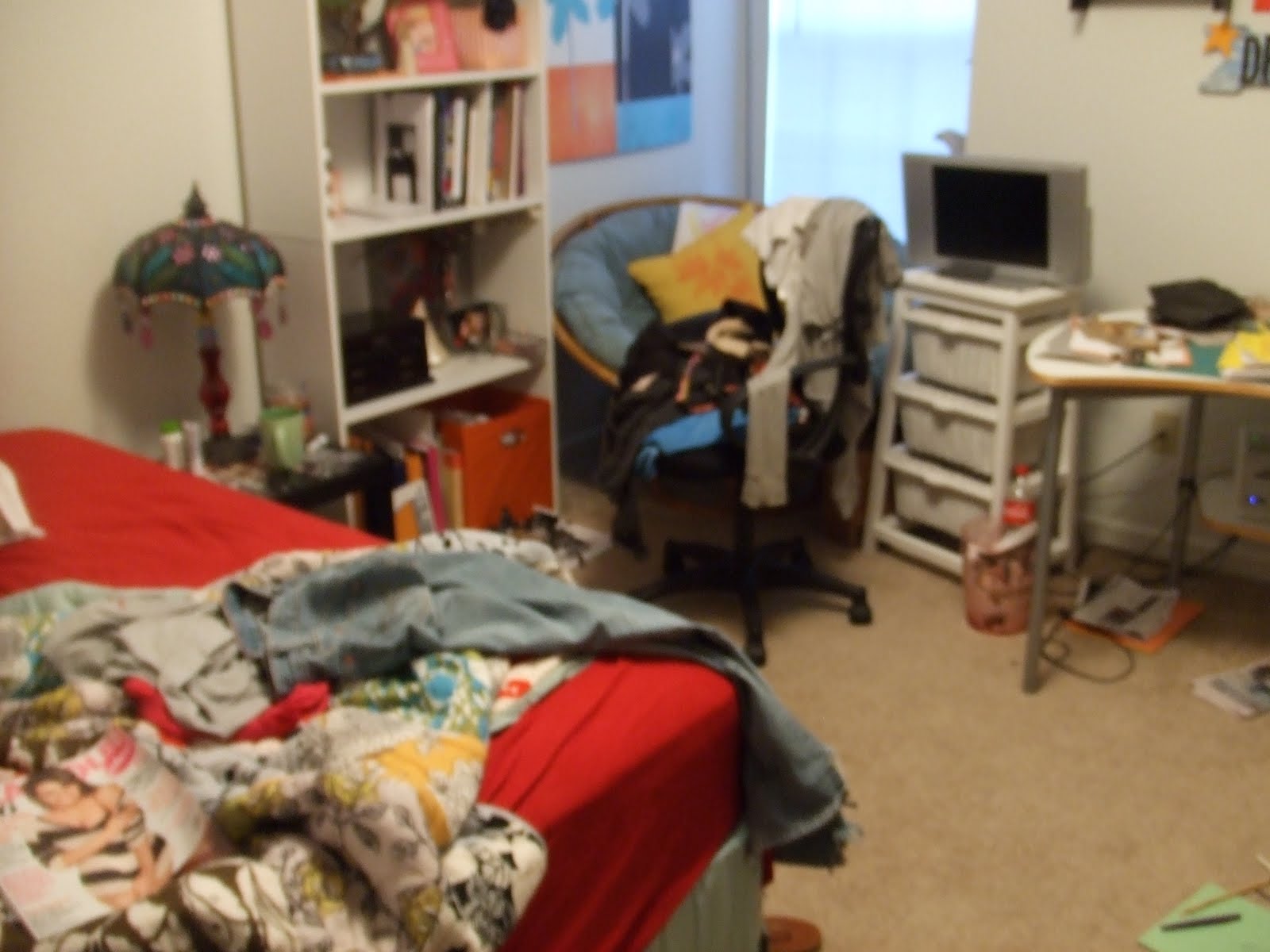
This inspired me to share my room/workspace with you...


Thank you for not judging my mess.
Happy designing.
-D
This weekend, while I was stumbling around looking for some interesting blogs to follow for my journalism class, I came across this post. It shows mostly writer's rooms but there are a few illustrators and composers' work spaces too.
http://www.guardian.co.uk/books/series/writersrooms
Check it out for yourself
This inspired me to share my room/workspace with you...


Thank you for not judging my mess.
Happy designing.
-D
Saturday, September 18, 2010
People Like Us.
Some stuff I liked by people like us
http://www.wix.com/lp_designs/lp_designs
http://mediamilitia.com/get-inspired-014/


http://www.wix.com/lp_designs/lp_designs
http://mediamilitia.com/get-inspired-014/


Inpiration Point.


 << Nike rocks.
We are all sooo close to the end of the first two projects. Its nice to know that everyone is feeling the pressure too. Hang in there everyone!
Wednesday, September 1, 2010
Today I Type to You
Adrian Frutiger: Today I type to you.
Without your creation of some of the most commonly known, and widely used, font in the world, where would we be today? Well, the Charles De Gaulle International Airport in France wouldn't have this sign:

Today, Frutiger font is commonly used on signage, such as this, and logos.
Frutiger's work with type began at a young age with an apprenticeship as a compositor. He then continued his studies at the Zurich School of the Arts and Crafts. After, he worked as a typeface designer at Deberny & Peignot in Paris. He also founded his own studio in collaboration with Bruno Pfaffli and Andre Gurtler.

In 1957 Frutiger established his position as an international typeface designer with his Univers-san serif font, produced for metal and film.
In the 60s' and 70s' you could get Univers for the IBM Selectric typewriters. Until 2007, Apple used Univers for the keycaps on many of its keyboards.

Currently the Univers type family consists of 44 faces with 16 uniquly numbered weights, widths, and position combinations.
Subscribe to:
Posts (Atom)